

In the age of waning attention spans, there’s a lot to be said for brevity.
Just like it manages to achieve potent and intense effects through subtlety, minimalist web design is equally unpretentiously getting established as one of the most popular design approaches.
This is no surprise when you consider how closely most of its principles conform to general web design best practices and how they cater to some of the most important user expectations.
A well-designed minimalist website will inherently be responsive, easy to navigate and SEO-friendly.
This is achieved through adherence to certain principles and use of different techniques.
Content first
A lot of people seem to be forgetting that pages are there to support the content, not the other way around.
Minimalist design provides the best, least intrusive background for your content, never distracting from it.
Avoiding flashiness and fluff, and returning the focus where it belongs – to content, makes it plainly obvious which of your pages actually have a purpose and which should be changed or removed.
Don’t confuse the pragmatic while harmonious simplicity that minimalism preaches with superficiality.
This style is committedly consistent in its principles – it doesn’t just advocate moderation when it comes to the number of page elements, it also assumes the same approach to the amount of content and even the number of pages themselves.
Source: https://www.monicalovati.com/studio


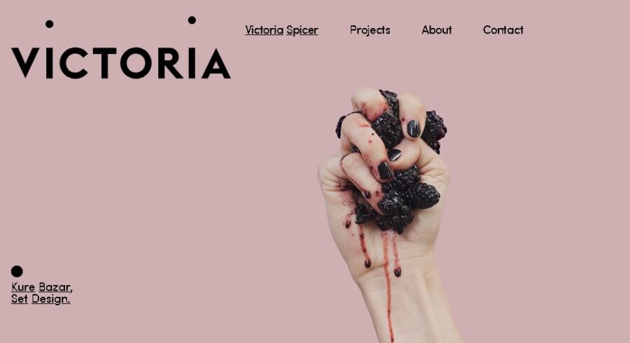
Contrast
The effects that pronounced contrasts have on a human mind are not exactly a recent discovery.
While their ability to accentuate something by comparing it with its opposite has more to do with how our brains are wired, there is a property of contrast that we have practically invented.
Just how we have learned to embrace and leverage disharmony in music by training our ear to tolerate it and finding applications for the discomfort it causes on an instinctual level, skillful use of contrast can cause a similarly distorted effect, one we have learned to recognize and appreciate.
Delicate manipulations required to achieve just the right intensity of clashing between the colors of the elements, their distribution, shapes or sizes, are not only supposed to make the page more visually appealing but also to set up an obvious hierarchy of those elements.
Source: https://vspicer.com/

Negative space
Also known as white space, could arguably also be considered a type of contrast – one confronting matter and the void, presence and absence. Regardless of its classification, this is one of the elementary techniques of minimalist web design.
Even though its use could be simplified to:“Ensuring that the element you want to accentuate has a lot of breathing room”, actually achieving the desired effect is nowhere near as easy as that.
Aside from ensuring that all the essential elements are present above the fold and that they are not disrupting the emptiness, you have to make sure that the same dynamics are somehow maintained on screens of different sizes.
Since negative space relies on proportions and scales for its effect, this is by no means an easy task.
Learning a bit about image composition, application of Golden Ratio in art, etc. might help you appreciate the theoretical nuances of this technique a bit more
But if you want to see how this is being done in practice, in one place, look for lists of most prominent web design companies, inspect their portfolios, and perhaps apply what you’ve seen in a project of your own.

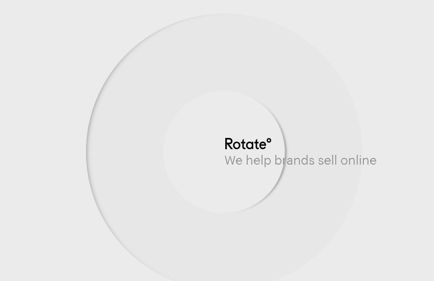
Source: https://studiorotate.com/
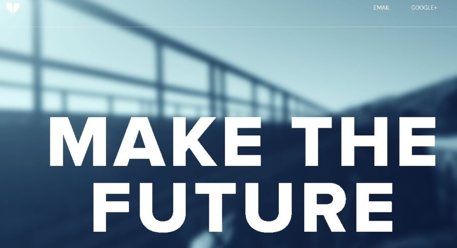
Daring typography
By discarding page elements until they are left only with bare essentials needed for the site to operate, minimalist web designers are limiting the number of opportunities to be a bit flashy.
That’s why being a bit more flamboyant when it comes to typography probably almost seems like a free pass to them – as long as we have to have letters, we might at least make them interesting.
Aside from being another, probably the least roundabout way of accentuating content, your choice of typeface can convey a message of its own.
Just like with contrast, we have, either instinctually or guided by tradition, developed certain responses to certain fonts. Some annoy us, some amuse and some even make us feel all warm inside.
Like most page elements, they also play a major role in establishing a visual hierarchy, but unlike most, they do this by throwing subtlety to the winds.
Minimalist websites often feature short yet huge messages, written in a bold, unapologetic typeface, immediately explaining why that particular page might interest you.
Source: http://dicksonfong.com/

Straightforward structure
Making something more simple cannot always be achieved by removing its elements, sometimes the exact obvious is true.
Just like you need to find a balance between two contrasting colors, you also need to be very careful about the navigational elements you will keep or reject.
Too many of them easily make the pages cluttered and disrupt what harmony you’ve managed to achieve, but too few will leave your visitors confused and frustrated.
A lot of minimalist websites are solving this through use of a simple, permanently available navigation bar in the header but, often-criticized ‘hamburger’ buttons are probably just as frequent, despite requiring you to take an extra step before even seeing the navigation.
Regardless of the method you choose for your website, remember, minimalism is supposed to make the entire browsing experience more streamlined for users, not have them blindly wandering around your website trying to decipher your cryptic scavenger hunt messages written in all caps.
Source: https://www.simple-shape.com/


Conclusion
Quite appropriately, minimalism doesn’t have a lot of rules – improve what you have instead of adding new stuff, balance functionality with aesthetics, and provide for the users.
This is achieved through the skillful use of negative space and contrast, experimenting with typography and establishing a logical site structure, but it’s not enough to be familiar with individual techniques in order to be successful in this area.
It is the understanding of their interactions that will allow you to create a cohesive, purposeful and beautiful website.